The third Digipack i decided to analyse was Plan B's 'The Defamation Of Strickland Banks'

The front cover is presented as the artist sitting on a stage with an old fashioned theatre sign above him, where the letters can be placed on and the lights behind it light up to brighten up the letters and appeal to people. This sign takes up most of the top of the cover where it will be the first thing the audience sees when they look at the cover and will see that it says 'Plan B Presents' and willl know that it is the Plan B album. There is very little lighting used in the cover where most of the shot is dark , however the artist sitting on the stage is shown in a spotlight which emphasises the theatre theme, as it is showing him to be lit up on stage as an actor/actress in a theatre would be. The colours used are minimal with there being alot of black for the darkness, a red colour of the letters which continues to the stagefront where the artists legs are hanging, andf then the yellow lights from the sign board, and the bage from the artists suit, so very simple and basic colours. The artist is shown to be looking to the floor to show him thinking, and the spotlight being on him relates to fame aswell as the sign above him, and so maybe he cant take the fame and that it is too much.

The back of the CD case is very similar to the front where we again have the the sign board with the placed on letters on it showing the tracklist, and this shows good continuity, also the colours black surrounding it being similar to the front of the case. The lit up board again attracts the audience to the tracklist as it is the main thing in the shot and also it being the only source of light will make it the main focus and will deter the viewer from the darkness around it. The barcode is in the bottom right of the case and is out of the way of anythning important so that it doesnt't disrupt the main focus of the shot. Similarly the record companies etc text is in small print and is again like the barcode, out of the way of the main focus and so is suitably placed on the case and being white makes it able to, and easily read by the viewer so they can see who the recored companies, and dates etc are for the album.

The left of the inside of the CD case (behind the front cover) is a simple yet effective shot of the artist. It shows him again to being surrounded by darkness with the light shning on him, and this reflects the front cover of the CD case. Similarly to the front of the case, he has his head facing down, but in this shot it seems as if he has his eyes closed which could show him to be relaxing in his music and feeling it all throughout himself as there is a microphone showed just to the right of him, showing him to be in mid song. The use of a black and white shot goes well with the style of microphone as this style of microphone is one that was used years ago as were black and white cameras and this shows good continuity in the shot.
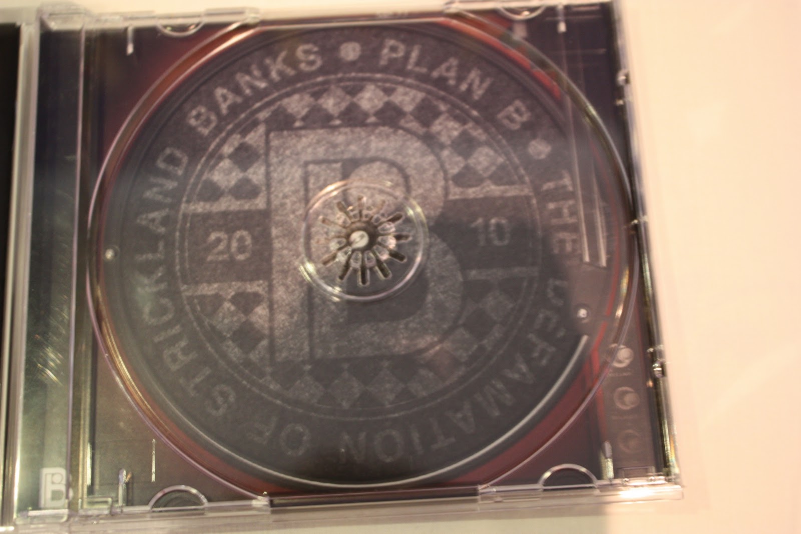
The right of the inside of the CD case shows what looks to be a logo type of design where we have patterened text going around in a circle reading the artists name and album name. This surrouds a big 'B' in the middle of the design relating to the artist 'Plan B' an then the date '2010' starting on the left and ending on the right of the big 'B' showing the album was released in 2010. There is a checkered pattern around the big 'B' and all of the design uses the same colours which is two simple coours, black and grey, but with a gristly/faded look which shows some continuity from the CD case and left of the inside where there are black colours used and the theme of darkness.

The advert poster for the abum has the same picture from the front of the album and so when the audience see this they will be remined of the album and so whenever they ee it in a shop they will immediatly know that it is the album from this advert. This is an effective way of advertising as there is no change to what they are seeing and so no cofusion is present if they are looking for the album. having the artists name at the top in big bold red writing attracts the audience and lets them know who the artist is and f they wanted an album by this artist then they are looking at the right advert and will know this from seeing the name. There are star ratings of the abum from different companies who have all rated the album 4 out of 5 stars which is very good, making the album a successful one an this will attract the audience even more, because if they see that its been rated high, then they will think that it must be a good album and be convinced to buy it.
good work Georgeykins!
ReplyDeleteCheers buddy :D
ReplyDelete