Monday 31 October 2011
Tuesday 18 October 2011
Filming Day 2
Today we filmed the rest of our draft music video. It was intended to be filmed on a park in the sun, but due to bad weather conditions, we were forced to film inside at a cast member's house. Obviously then, it was not as planned on the storyboard, and we were forced to improvise with our shots.
We changed the idea of playing football to playing on a Nintendo Wii and general jovial behaviour.
In the circumstances, we are happy with the footage taken, however come the time for the final music video to be produced, this section may have to be revised.
We changed the idea of playing football to playing on a Nintendo Wii and general jovial behaviour.
In the circumstances, we are happy with the footage taken, however come the time for the final music video to be produced, this section may have to be revised.
Thursday 13 October 2011
My Mock-Up Digipak
Here is my first mock-up of Perplexa - 'Big City Prison'. I was originally going to call it 'Sides & Angles', but decided to go against this, and use lyrics from the song we are doing for our music video (Big City Life) to maintain continuity and a theme. For the mock-up, I have used images found on the internet, cropped and edited, which I shall emulate when it comes to producing my final piece.


For the final version of the front and back covers, I hope to use a blur effect on the people in the shot (apart from the artists).


Once produced, I fitted my printed mock-up into a CD case to see what it looks like physically. I was pleased with the results.


For the final version of the front and back covers, I hope to use a blur effect on the people in the shot (apart from the artists).
Digipack Analysis - The Defamation Of Strickland Banks
The third Digipack i decided to analyse was Plan B's 'The Defamation Of Strickland Banks'

The front cover is presented as the artist sitting on a stage with an old fashioned theatre sign above him, where the letters can be placed on and the lights behind it light up to brighten up the letters and appeal to people. This sign takes up most of the top of the cover where it will be the first thing the audience sees when they look at the cover and will see that it says 'Plan B Presents' and willl know that it is the Plan B album. There is very little lighting used in the cover where most of the shot is dark , however the artist sitting on the stage is shown in a spotlight which emphasises the theatre theme, as it is showing him to be lit up on stage as an actor/actress in a theatre would be. The colours used are minimal with there being alot of black for the darkness, a red colour of the letters which continues to the stagefront where the artists legs are hanging, andf then the yellow lights from the sign board, and the bage from the artists suit, so very simple and basic colours. The artist is shown to be looking to the floor to show him thinking, and the spotlight being on him relates to fame aswell as the sign above him, and so maybe he cant take the fame and that it is too much.

The back of the CD case is very similar to the front where we again have the the sign board with the placed on letters on it showing the tracklist, and this shows good continuity, also the colours black surrounding it being similar to the front of the case. The lit up board again attracts the audience to the tracklist as it is the main thing in the shot and also it being the only source of light will make it the main focus and will deter the viewer from the darkness around it. The barcode is in the bottom right of the case and is out of the way of anythning important so that it doesnt't disrupt the main focus of the shot. Similarly the record companies etc text is in small print and is again like the barcode, out of the way of the main focus and so is suitably placed on the case and being white makes it able to, and easily read by the viewer so they can see who the recored companies, and dates etc are for the album.

The left of the inside of the CD case (behind the front cover) is a simple yet effective shot of the artist. It shows him again to being surrounded by darkness with the light shning on him, and this reflects the front cover of the CD case. Similarly to the front of the case, he has his head facing down, but in this shot it seems as if he has his eyes closed which could show him to be relaxing in his music and feeling it all throughout himself as there is a microphone showed just to the right of him, showing him to be in mid song. The use of a black and white shot goes well with the style of microphone as this style of microphone is one that was used years ago as were black and white cameras and this shows good continuity in the shot.
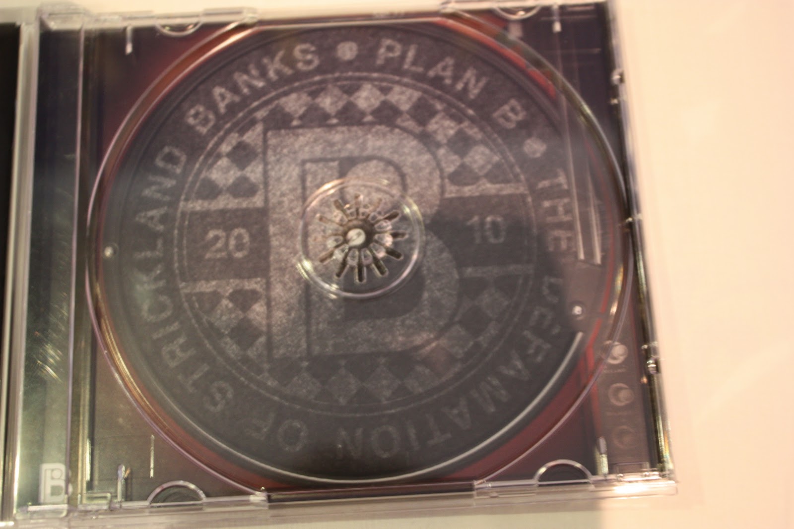
The right of the inside of the CD case shows what looks to be a logo type of design where we have patterened text going around in a circle reading the artists name and album name. This surrouds a big 'B' in the middle of the design relating to the artist 'Plan B' an then the date '2010' starting on the left and ending on the right of the big 'B' showing the album was released in 2010. There is a checkered pattern around the big 'B' and all of the design uses the same colours which is two simple coours, black and grey, but with a gristly/faded look which shows some continuity from the CD case and left of the inside where there are black colours used and the theme of darkness.

The advert poster for the abum has the same picture from the front of the album and so when the audience see this they will be remined of the album and so whenever they ee it in a shop they will immediatly know that it is the album from this advert. This is an effective way of advertising as there is no change to what they are seeing and so no cofusion is present if they are looking for the album. having the artists name at the top in big bold red writing attracts the audience and lets them know who the artist is and f they wanted an album by this artist then they are looking at the right advert and will know this from seeing the name. There are star ratings of the abum from different companies who have all rated the album 4 out of 5 stars which is very good, making the album a successful one an this will attract the audience even more, because if they see that its been rated high, then they will think that it must be a good album and be convinced to buy it.
Digipack Analysis - Bud Sweat and Beers
The second album i have decided to analyse is Devlin's 'Bud Sweat And Beers'.

The Front cover of the CD is very simple in which it shows the artist leaning against a brick wall. The artist is wearing simple clothes, including a polo shirt with black trousers and black shoes. This one colour against the brick wall makes the artist stand out and is an effective way of showing him to the audience. The way he is positioned against the wall is that he has his arms behind his back and one leg bent and foot prressed against the wall, with an expression on his face as if he is looking at something out of the shot to his right (our left) and this makes the audience wonder what it is that he is looking at. Having the brick wall in the whole shot, makes it seem like an urban area and that the surroundings are quite old and mucky. This gives a sense of it being like an estate area and that the artist is trying to break out and make a life for himself and not wanting to be stuck in there for the rest of his life. The artists name 'Devlin' is placed in the centre right of the cover and the use of the colour white for it contrasts the clothing of the artist and makes it stand out more and catches the audiences eyes being big and bold. The name of the album is placed directly underneath the artists name and uses the same colour as the name of the artist however the font type is completely different and it is like the artist has written it himself to show its his own work and this is an effective way of getting the name across as it shows independence of the artist and the name of the album being 'Bud, Sweat and Beers' lets us know that the album is going to be about drugs, hard work and alcohol, which some people can relate to as its about the pleasures and displeasures in life.

The back of the CD case is almost the same as the front where we have the brick wall to show show good continuity, and we also have a child running with what looks like a folded piece of paper or maybe something wrpped in a bag, and this gives a sense of suspicion for the audience as they might wonder what it is and why he is running with it. There are the same colour scheme used on the back as it is on the front with the white text, where on the back we have the track list in the same font as the album name on the front which looks again like it was the artist who wrote it and it is positioned down the left of the back of the case and fits in well with the child running from the left to the right of the shot. Realting to the front of the case, if the CD were to be opened then as i said before when Devlin is looking to his right, he is looking at this running child and this shows good continuity as the front and the back of the case fit into each other as one whole shot. The barcode is placed in the top right corner away from the main part of the shot so it does not cover anything needing to be seen and also the record companies and dates which are placed in the bottom left and use the same colours as the text so that it fits in well with the rest of the back cover.

This album advert for Devlin's album is one that would be shown on the internet or in a computer music store such as Itunes, as it says 'Click to buy it now', and this straight away pulls the audience into making a decision about whether or not to get the album. The advert is the same shot used for the album cover where we have the artist leaning against a brik wall and looking to the right out of the shot, ad this familiarises the audience with the album as they might have seen the CD somewhere and then wanted to get it online etc and they will be able to notice it straight off which pulls more people into buying it. the text is the same for the artist name and album name, but made slightly bigger and moved up a little to attract the audience and also to make room for the text 'the debut album, featuring Runaway'. Having the ame of one of the singles on the advert will get some of the audiences wanting to buy the album as this might be one of their favourite songs and therefore click on the link to buy the album. Havig all the text short and big and bold enables the audience to quicly read it an not have to read lots which might bor some people, and so it is quick to the point and grabs the attention of the audience and is an effective way of advertising.
Wednesday 12 October 2011
Filming Day
Today we went into Leicester to film the main bulk of our music video (9am-4pm). Due to our comprehensive storyboard and planning, filming was as straightforward as possible, as we knew what to film, in what order, and in what location.
As you can see on our schedule, we filmed all the parts situated in one location before moving on to the next one, thus minimising time wasted moving between locations.
We are very pleased with our days work, as it was very productive.
Filming the small section remaining of our music video will take place in the near future; between now and then, we will begin the editing process.
Digipaks
Before starting to analyse digipaks, I felt it was important to familiarise myself with existing ones, in order to both gain inspiration, and also to further my understanding about what it means to be a digipak (ie, what it requires). In particular, I was interested in album covers.
I looked at these books to do this.


I looked at these books to do this.


Thursday 6 October 2011
Inspiration For Album Covers
Some album covers i have been looking at for inspiration on my CD case cover include:


'Me Against The World' by Tupac. This inspired me as it has a simple, dark colour scheme which features just the artist on his own, and nothing going on in the background except for what he is leaning against and smokey mist which sets a gloomy theme. I would be using both of my artists if i were to emuate this where i would be able to have them both in the shot and still be able to get the same theme.
'The Crack House' by Fat Joe, this inspired me as it again is simple with its simple colour scheme, aswell as having a close up of the artist in the shot which is something we have considered to do for the cover as it allos the audience to get a good look at what the artist looks like and can see the expression on their face and try to figure out what their about.
'Late Registration' by Kanye West. The main thing about this album which inspired me was the use of the bear standing in the centre of double doors which are half opened, and you can see the shadow of the bear coming out of the shot down the middle. If i wee to emulate this i would obviously not use a bear, i would be using both of our artists where i would have them standing against one another in the centre of the opened or slightly opened doors as the bear is in this shot. This would give the impression that they have just entered the scene and are gog to be big.
'Criminal Minded' by KRS-ONE. The main inspiration of this album was the id shot of both of the artists in a dark room where i would be able to emulate this, but without the guns as i do not want to make my artists seem violent. However for this album cover the use of the handguns goes well with the name of the album as it shows them to be criminals as criminals carry around weapons. I would be able to use lighting like this as well and maybe have even less to make the scene seem mysterious and position the artists similarly next to each other with serious expressions on their faces for emphasis on the dark theme that is going on.
Wednesday 5 October 2011
Digipack Analysis - Slim Shady LP
The first digipack i have decided to analyse is Eminem's album 'The Slim Shady LP' which has many elements that relate to the songs on the album.


On the cover there is a dark and almost scary complexion, and having the large moon in the centre of the shot at the top of the cover and the clouds surrounding creates a nightmareish theme. To add to this there is a pair of legs hanging out the boot and there is a figure of the man and what looks like his child. This whole cover all relates to one of the songs on the album called '97 Bonnie & Clyde' where Eminem takes his daughter to the beach, where on the album cover we can see him on a pier with her, and in the song he is talking to his daughter as if they were actually going on a trip to the beach, however the real reason is that he has killed his wife and is going to throw her in the sea which is shown on the cover by the body in the boot of the car. there is a good use of colour on the cover, a simple mix of black, white and purple, which even though is only few colours, is very effective in grabbing the audiences eye as it pulls them in as well as the positioning of the mise en scene of the legs in the car boot and figures of the artist and his daughter. In having the fence which surrounds the pier positioned the way it is, coming out of the shot, it makes us want to walk up past the car and get a closer look into who the figures of the people are if you didnt already know, and see what they are up to. The name of the album is in the bottom right of the cover and contrasts the rest of the cover as it is in multicoloured and what looks like a child has written, and although it doesnt go with the rest of the cover, i think it is a good way of showing the album as it catches the audiences eye away from the theme of the cover and can maybe change their opinion of what the album is about as the writing has a good feel to it and is nice one with the use of the baby blue, yellow, red and green colours. it is likely that the writing has been used this way as some of the songs on the album e.g. '97 Bonnie & Clyde' and 'Rock Bottom' the artist relates to his daughter by rapping a little about her and putting this onto the cover is useful as it shows good continuity.

On the back cover of the album we have the main artist taking up most of the cover on the left and middle where he is holding his hands on his head and has his eyes closed, with an expression on his face which seems like he is trying to forget things and clear his mind from the world around him. The background of the back cover uses the same colours as the front cover to show good continuity which is more appealing to the audience as it is similar and not completely different. Also in the background we can see what looks like to be trees branches as if the artist was out in the woods at night and is alone, trying to forget everything like i mentioned before, and try and get away from it all as he is frustrated. Again the use of colours creates a dark and gloomy experience for the audience and could be expressing the artists darkness within. The song names are listed down the right hand side of the back cover, right next to the photo of the artist and they start and finish at the head and torso of the artist which makes it fit in well and look better. The barcode is in the top left hand corner which is normal to have on a CD cover and doesnt interupt the feel of the poicture, aswell as the record companies and copyrights which are in the top right hand corner which text matches the text of the song list, which is a font which was used by typewriters and gives the back cover a good effect.

On the inside of the CD case this is the picture which is on the left of the CD itself. It has no relation to the covers theme which i think is good as it is as if the outside of the CD case has its own theme and then the inside of the case has a completely different one which is effective and creates a happier mood when opened as it has the artist standing there with his hands up and a funny expression on his face. This shows him to be in a completely different mood than what he was on the back cover of the case. There is a fully yellow and orange wall behind him and a drawing of a window and plant in the window, all using bright colours like, blue, red, green and a bit of white, this makes the scene seem happy and cheerful, however the artist has blood on his shirt, which will make the audience think of him as being crazy and the fact he is pulling a face would make him look like a psycopath.
In the CD case, this is the picture of what is behind the CD and goes back to the them of the the albums cover, with the dark and gloomy clouds and moon with the purply and black colours. This time though, there is a drawing of a mummy being attacked by drugs with teeth and faces to empahasise their evilness and how bad drugs can be. There is also syringes stabbed into multiple places of the mummy's arm, chest and legs as if it is being taken over by drugs completely which relates to the artists songs as he talks alot about drugs in the songs. There is a lightening bolt striking through the sky behind the mummy and this creates a more evil mood along with the drugs and mummy, and shows that the album contains alot about drugs and evil things.

This is the Promo Poster for 'The Slim Shady LP' and as you can see it is almost exactly the same as the album cover, which shows good continuity. The few differences are that the colours used are black and white instead of the purple, however there is a slight hint of purple in the title at the bottom of the poster reading the albums name. There is also the artists name written across the top of the poster which attracts the audiences eye to know who the poster is about and it is in the continuous font which Eminem always uses for his albums.
Looking At Digipacks
We have begun to start looking at different digipacks for albums, and will need to analyse and create our own for our artists. This includes the front and back of the CD case, the inside of the case and also to create a poster of the CD. Digipacks we will be looking at will be the genre we have chosen to do which is Hip-hop and ideas that come to mind are artists such as Eminem, Professor Green, Devlin, Example, Tinchy Stryder and Tinie Tempah, and others. After analysing 3 different albums, we will each create our own digipack and poster and then decide together which one we wil take forward and use as our final design.
Subscribe to:
Posts (Atom)